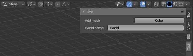
Interface elements in custom user panels often do not correspond to each other in size. As a result – the overall panel layout does not look beautiful. As an example, let’s create a custom panel and place an operator button and an input text field on it.
 Can we make it more accurate?
Code for creating this panel:
|
1 2 3 4 5 6 7 8 9 10 11 12 13 14 15 16 17 18 19 20 21 22 23 24 25 26 27 |
import bpy from bpy.types import Panel from bpy.utils import register_class, unregister_class class TEST_PT_panel(Panel): bl_idname = 'TEST_PT_panel' bl_label = 'Test' bl_space_type = 'VIEW_3D' bl_region_type = 'UI' bl_category = 'Test' def draw(self, context): layout = self.layout row = layout.row() row.label(text='Add mesh') row.operator('mesh.primitive_cube_add', text='Cube') layout.prop(bpy.data.worlds['World'], 'name', text='World name') def register(): register_class(TEST_PT_panel) def unregister(): unregister_class(TEST_PT_panel) if __name__ == '__main__': register() |
The location of buttons, labels and other elements is formed in the “draw” function.
All interface elements are located on a single layout “layout” (self.layout).
The row command of the “UILayout” class
|
1 |
row = layout.row() |
makes a line on which two elements are located one after another – a text label “Add mesh” and an operator button for creating a cube.
|
1 2 |
row.label(text='Add mesh') row.operator('mesh.primitive_cube_add', text='Cube') |
The “World name” property is located on the next line because it is called not from the “row” element but the entire layout.
|
1 |
layout.prop(bpy.data.worlds['World'], 'name', text='World name') |
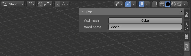
To nicely arrange the controls and align their sizes, we need to break the entire layout vertically into two columns. On the left we will place the text, on the right – we will place the controls.
The “split” command of the “UILayout” class divides the layout into columns proportionally by the “factor” parameter. Let’s make such split:
|
1 |
split = layout.split(factor=0.25) |
The command returns a split object on which we will make the columns themselves:
|
1 2 |
col_1 = split.column() col_2 = split.column() |
Having received the “col_1” and “col_2” columns we will place text labels on the first (left) and the button and field on the second (right) one.
For the operator:
|
1 2 |
col_1.label(text='Add mesh') col_2.operator('mesh.primitive_cube_add', text='Cube') |
and for the input field:
|
1 2 |
col_1.label(text='Word name') col_2.prop(bpy.data.worlds['World'], 'name', text='') |
Finally, the controls are located on our panel much more accurately.
 Complete code:
|
1 2 3 4 5 6 7 8 9 10 11 12 13 14 15 16 17 18 19 20 21 22 23 24 25 26 27 28 29 30 |
import bpy from bpy.types import Panel from bpy.utils import register_class, unregister_class class TEST_PT_panel(Panel): bl_idname = 'TEST_PT_panel' bl_label = 'Test' bl_space_type = 'VIEW_3D' bl_region_type = 'UI' bl_category = 'Test' def draw(self, context): layout = self.layout split = layout.split(factor=0.25) col_1 = split.column() col_2 = split.column() col_1.label(text='Add mesh') col_2.operator('mesh.primitive_cube_add', text='Cube') col_1.label(text='Word name') col_2.prop(bpy.data.worlds['World'], 'name', text='') def register(): register_class(TEST_PT_panel) def unregister(): unregister_class(TEST_PT_panel) if __name__ == '__main__': register() |