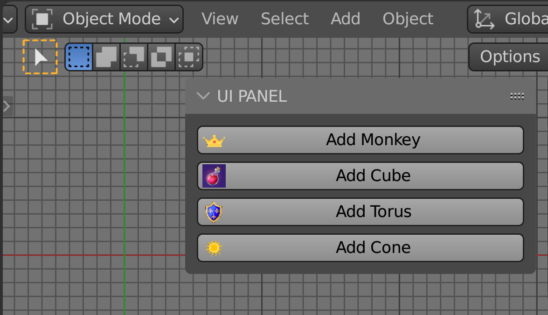
Mostly often Blender add-on developers use icons from Blender built-in library to personalize UI buttons. However, absolutely any external images can be uploaded and used as icons in the UI.
We can use images as icons in the UI using the “previews” module from the bpy.utils package.
To upload an image, which we will set as an icon on the button later, first create a “preview” collection:
|
1 2 3 |
from bpy.utils import previews icons = previews.new() |
Here we created an ImagePreviewCollection into which we can now load any images using the load() method.
|
1 2 3 4 5 |
icons.load( name='crown', path='c:/temp/crown.png', path_type='IMAGE' ) |
To load an image into the preview collection, in the parameters of the load() method, we need to set:
- name – name, identifier through which we will refer to the uploaded image in the collection.
- path – full path to the uploaded image.
- path_type – the loaded content type. Can be: ‘IMAGE’, ‘MOVIE’, ‘BLEND’, ‘FONT’. For images, the ‘IMAGE’ value must be specified.
Now let’s define a class for the simple user panel in the 3D viewport area with single button:
|
1 2 3 4 5 6 7 8 9 10 11 12 13 |
class TEST_PT_panel(Panel): bl_idname = 'TEST_PT_panel' bl_label = 'TEST' bl_space_type = 'VIEW_3D' bl_region_type = 'UI' bl_category = 'TEST' def draw(self, context): self.layout.operator( operator='mesh.primitive_cube_add', text='Add Cube', icon_value=icons['crown'].icon_id ) |
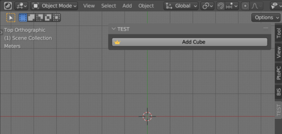
In the draw() function, in the description of the operator that will be called when the button is clicked, we used the “icon_value” parameter. The value for this parameter is the icon identifier, we took it from the preview collection created earlier, referring to the desired element by the given name (icons[‘crown’]) and getting the “icon_id” value from it.
Next, register the panel class in the Blender Python API:
|
1 2 |
def register(): register_class(TEST_PT_panel) |
Now, if we execute the register() function, in the user panel in the 3D viewport area we will see a button with our custom icon.
We can use absolutely any image as icons this way.
If we need to load several images to be placed on different buttons, each image must be loaded into the collection by calling the load() method and specifying the path to the desired image.
When we unregister the add-on, the preview collection must be removed from the API.
|
1 2 |
def unregister(): previews.remove(icons) |

 .blend file on Patreon
Hi! do you know how we can use custom icons inside enumproperties? I can put inside, but doesn’t work. I supose this happens because custom icons are using “icon_value” instead of “icon” property.
Hi!
You can use custom icons in EnumProperty. Try specify them like this:
Hi, I’m getting an error in draw.
KeyError: ‘crown’
I use Blender 4.0
Hi!
Do you have an icon file with the name “crown.png” in the same place where you save the .blend file ?
How can I adjust the width of the icon?
I don’t think that it is possible to change the icons size themself, but you can change the UI scale at all by holding the middle mouse button and sliding the panel.
What if you need icons to use dynamic web url images as sources?
I don’t think that this could work. You need to save them to the local place on your hard drive first.
How would you distribute this icon with an add on?
Just distribute them in the add-on folder.